

[This story has been revised and updated.]
Big data has turned out to be a key ingredient in turning machine learning from an abstract technology into a potentially invaluable tool of insight and foresight for businesses across industries. The burgeoning cognitive technologies of predictive analytics and data visualization are opening new windows of opportunity to companies trying to solve complex problems with multiple moving parts. From finding ways to retain new customers to more efficiently monitoring multiple performance metrics and easing performance volatility, more companies are gravitating towards machine learning-based data analysis tools in an effort to optimize operations and find innovative solutions and opportunities that were once too obscure for only the human eye.
The companies leveraging this big data and machine learning technology are the new kids on the block, and most businesses remain in the dark about their existence or how they operate. Regardless, their time is just around the corner, and how big data is manipulated and delivered is what matters most to clients, who are often company executives and key operations personnel making costly decisions and/or hoping to solve the most elusive problems based on their own sets of big data.
Valuenex, Inc. is a relatively established company in the predictive analytics niche, already at the decade-old mark. Founded by Dr. Tatsuo Nakamura in 2006, the Tokyo-based company now has offices in Silicon Valley and offers their predictive analytics and data visualizations services in the native languages of English, Japanese, Chinese, with more translations forthcoming. The company has made its way by analyzing reams of data and developing a set of data visualization products that “enable clients to find information rather than search for it.”
‘Find’ entails looking at a set of visualization graphics and assessing the opportunities present within the analyzed data, as opposed to ‘searching’ for answers by manually sifting through and making sense of individual pieces of data at a time. Machine learnings systems are based on neural networks that can be fed thousands of documents at at time and produce correlative and meaningful data in a matter of hours (as opposed to thousands of man hours).
The company’s predictive analytics model is more than just algorithms; a consulting and and technical team is still an important part of the collaborative show. Presenting patterns found in millions of data points is a machine’s unparalleled strength, but producing intuitive insights and imagining possible outcomes based on such data is still a domain ruled by humans. Together, the two make a formidable pair and present potentially invaluable opportunities for today’s and the next generation of businesses.
In a recent interview with Dr. Nakamura and Sam Kovach, a senior analyst at Valuenex, we got a firsthand sense, based on real-life examples, of how data visualization can be combined with machine learning to help businesses make important decisions. The following examples are just two possible use cases for how to apply predictive analytics and data visualization technologies within a particular industry.
Finding Emerging Market Opportunities
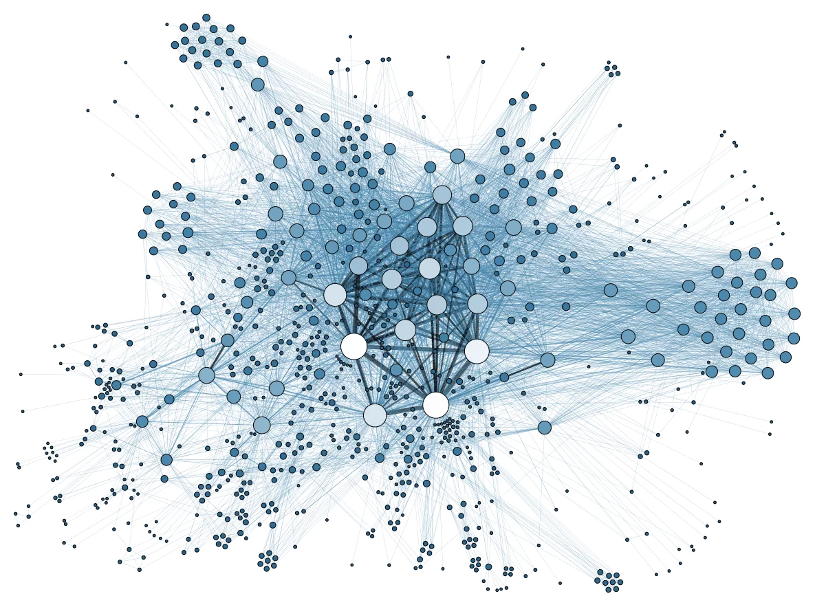
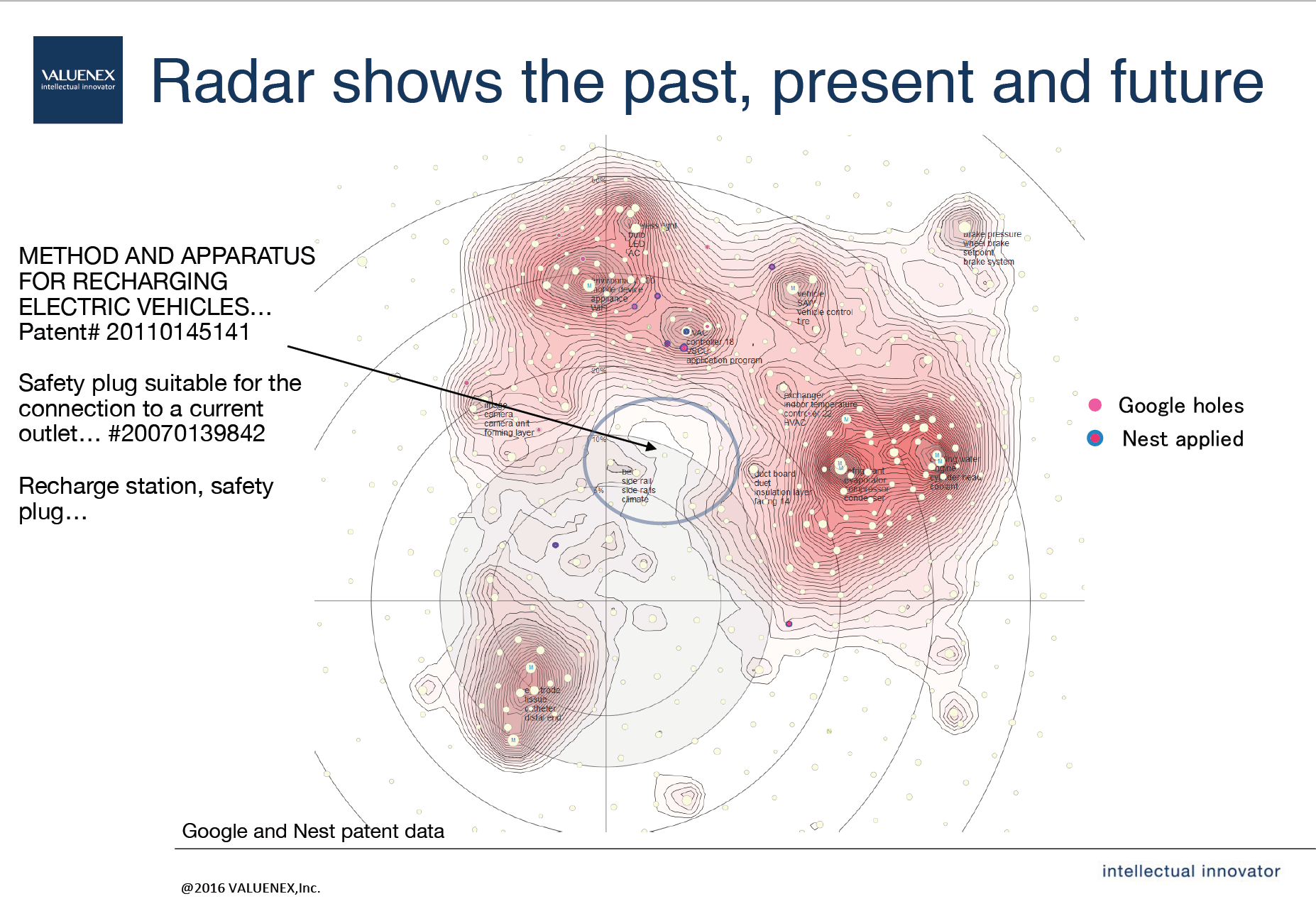
Produced with Valuenex’s ClusterMapViewer, the image below was developed for Google and Nest Labs (an Alphabet-owned company), and shows the ‘clustered’ patterns of about 30,000 patents from 2005 to 2014 that were filed by thousands of companies containing technologies that overlap with those of Google and Nest. Alphabet used these graphics to pinpoint potential emerging market opportunities within their existing technology niches (notice the arrow pointing to a white space that looks as if it’s about to be swallowed up by surrounding swirls of pink weather systems – more details to come).
 A still-shot from 2016 of Google and Nest patent data, along with thousands of other companies who hold patents in similar technology domains.
The different-colored dots form clusters, each containing groups of patents that were sorted and collated after being run through algorithms and ‘text mined’ for similar text semantics. Patents with similar text are grouped together, with larger numbers of patents forming more dense and darkly colored clusters on the map.
Sam Kovach compares the process of text mining and data analysis to deconstructing ‘castles of legos’. In essence, the analytics algorithm takes each individual ‘lego’ (or word) and groups it into a category based on similarity in semantics and relevance. Afterwards, the algorithm takes 5,000 more castles and breaks all of those down, putting those legos that are the same color in with established or newly forming groups. For example, electric vehicles and similar terms such as electric motor, permanent magnet electric, etc., will be grouped in a similar category.
Within Valuenex’s interactive Intellectual Property Dashboard, the above cluster map is interactive and can be shifted to view how patent information and the inherent text-based patterns have changed over time (from 2005 to 2014 ). It’s important to keep in mind that the x/y axis is not consequential; what matters is the distance between one group and another, indicating relatedness in meaning.
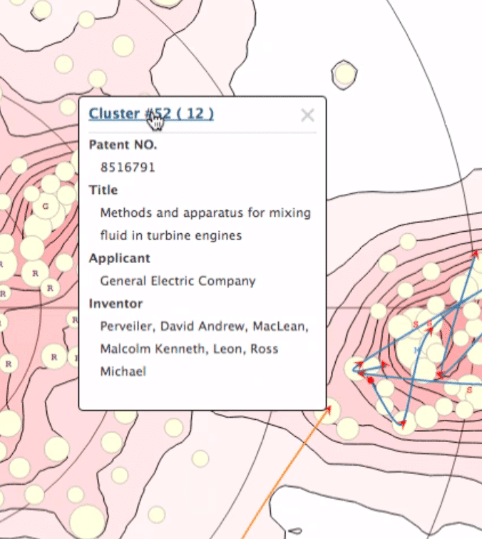
Sam demonstrated the ability to click on clusters to reveal the number of related groups within that cluster, and drilling all the way down to the specific keywords associated with specific patents. The semantics-based system breaks down every word in every document; whereas a typical human might start a Google search and stop sifting through documents on the fourth or fifth search page, Valuenex’s algorithm is still going strong on page 32,000 and through to the end, better ensuring that as much information as possible is being taken into consideration when assessing potentially valuable market opportunities.
The areas of high density (many key words grouped into many categories) increase the amount of clusters and are shaded a deeper color; however, the really interesting areas i.e. the potential valuable market potentials are those spaces of low density that are in between and around the high density ones, almost like a visible patch of sky before a swirling storm closes in (see opening example above in first section paragraph).
Dr. Nakamura and Sam refer to these lucrative areas as “white space” i.e. spaces that are poised to be overtaken by encroaching progress, but have not yet been fully realized. Predicted “white spaces” are one of the most valuable market patterns (in this particular form of data visualization), shining like ‘diamonds in the rough’ and indicating areas of future opportunities for grabbing intellectual property and making industry headway before competitors do.
Assessing Value in Potential Company Acquisitions
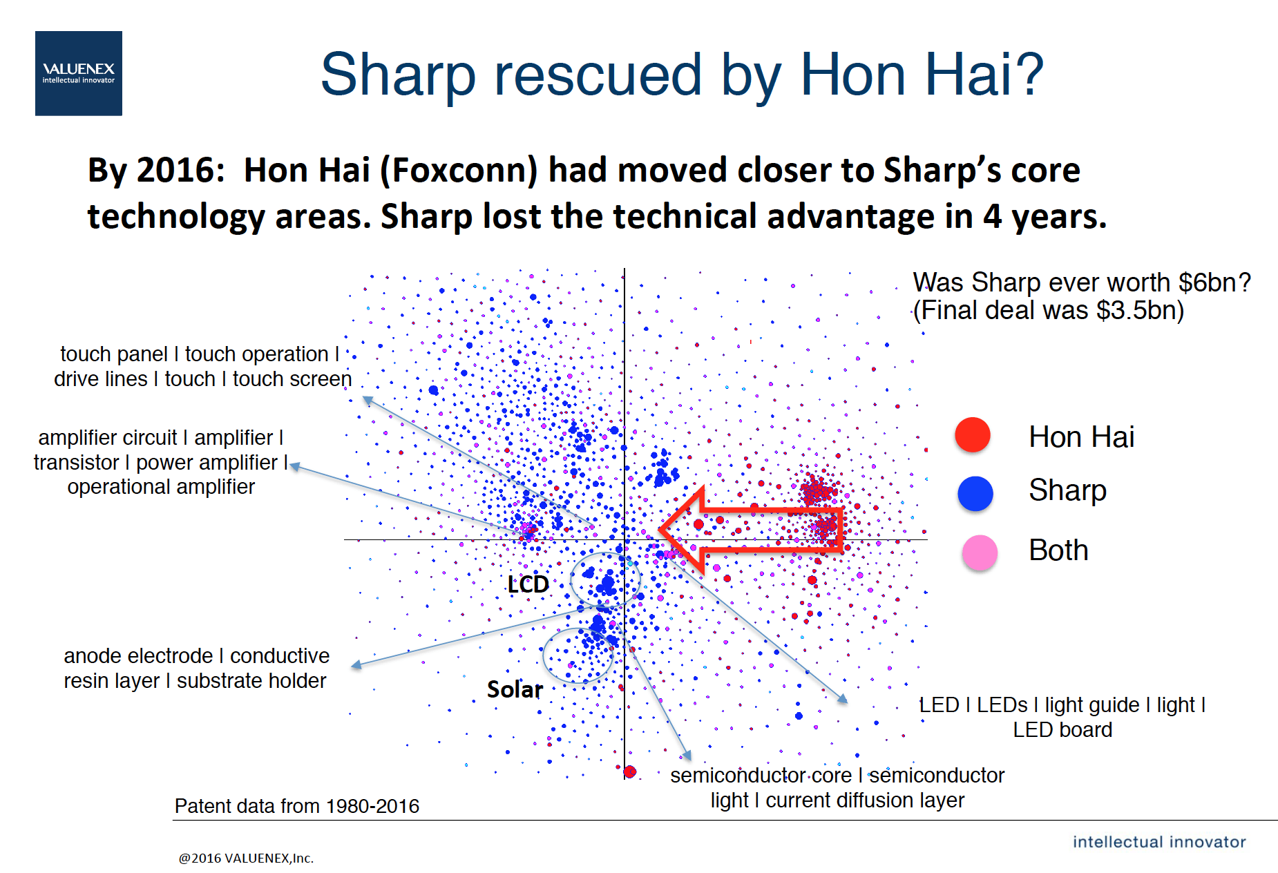
Groups of patents in similar areas are color-coded by company (pink represents overlapping technology).
A second real-world example shared by Valuenex is a diagram comparing Sharp’s and Hon Hai’s (Foxconn’s) developed and patented technologies in relation to each other’s. This particular image is a screenshot of both companies’ most recent developments before Sharp was eventually taken over by Hon Hai (Foxconn) in April 2016.
The red dots represent Hon Hai’s hold over a technology (i.e. developed products and services based on published research and filed patents), while the blue dots depict Sharp’s dominance in a particular domain. Pink clusters represent areas in which both Hon Hai and Sharp have research or filing patents in a similar niche (for example, amplifiers). In the interactive version of the diagram, which allows users to view how these patterns have changed over time, the pink clusters were fewer and farther between.
By 2016 (shown in image above), both companies had a lot more overlapping or ‘pink’ areas, signifying that Sharp had lost many of its advantages in key domains. This visual evidence was, according to Sam, a pivotal factor in its decision to hand over an initial 66 percent stake to FoxConn in April of this year. In addition to presenting justification for a potential acquisition, the data analysis helps tell a contextual story.
Near-Term Outlook
The above representations are just two examples of how predictive analytics and data visualization can be leveraged by companies. Business is really seeing just the tip of the iceberg in how to apply predictive analytics, data visualization, and other related technology tools. Customizable solutions to existing problems seem only limited by the types of unstructured data that can be fed to a machine learning system.
Within the next five years, businesses will also likely see an improvement in predictive analytics’ abilities to pull data from anywhere (i.e. connecting research papers, annual reports, and Twitter feeds, for example) and run this data to see real-time movements in pattern analysis, similar in concept to a live Doppler radar. This is something that clients want, says Kovach, but as of yet, it’s just an idea in the making.
Image credits: Valuenex, Inc.


