The rubber hits the road with landing pages. That’s when “website traffic” converts to leads … or not.
Of course, paid ads, content, and SEO all drive traffic to your site, but it’s the landing page that converts users into leads, and drives those leads toward a first appointment.
In this post, we will explore some best practices for landing pages, and give you some examples. By the end of the post, you’ll understand our approach for using landing pages to convert more leads and even to encourage more of those leads to qualify themselves.
Landing pages are a fundamental conversion tool for today’s AI product and service firms. Here’s how to overcome some important points that are often neglected when firms sit down to create them.
Landing Page Fundamentals
A landing page for B2B AI products or services should be a kind of gateway that shows a reader or visitor (who may or may not have any interest in your product or service) the road that leads toward becoming a potential prospect (who may have both interest in—and the ability to pay for—your offering).
A landing page should:
- Collect relevant contact information (usually: name, business email, phone number, company)
- Offer value to the prospect, helping them to solve a problem or move toward an opportunity
- Capture and communicate the level of interest of the prospect, indicating that they are worth follow-up to pursue a sale
We recommend collecting the amount of information needed to help your salespeople qualify the lead (i.e. “worth following up with now” or “not worth following up with”), and no more. If the company and job title are needed (which they often are), then include them. If company size is also necessary, add it.
We recommend requiring business-only emails (no Gmail, Yahoo mail, etc.), and making it necessary to provide a phone number.
A landing page may apply to various stages of the buying journey, and often, a mature B2B company will want to develop a series of landing page assets for converting leads.
Landing pages can generally be divided into top-of-funnel, middle-of-funnel, or bottom-of-funnel:
Top-of-funnel (ToFu): Aimed at prospects who are broadly interested in a solution like what you offer, or who are broadly interested in solving a problem that your solution solves.
- Example company: A fraud prevention AI vendor in the retail sector
- Example landing page offer: PDF Guide titled “eCommerce Guide to Reducing Friendly Fraud” (Appealing to anyone who’s struggling with the problem that your product solves)
Middle-of-funnel (MoFu): Aimed at prospects who are not only interested broadly in the problem you solve, but they are also likely to be qualified to potentially make a purchase (based on their role, seniority, specificity of their need, etc.).
- Example company: A fraud prevention AI vendor in the retail sector
- Example landing page offer: PDF Guide titled “AI for eCommerce Fraud Prevention 101 – Success Stories in Fashion and Apparel” (Appealing to anyone looking for an AI solution to the problem that your company broadly solves)
Bottom-of-funnel (BoFu): Aimed at prospects who are overtly looking to make a buying decision. They have a present need and are aware that your solution might be what solves it for them.
- Example company: A fraud prevention AI vendor in the retail sector
- Example landing page offer: PDF Guide titled “Product Deep Dive – A Full Breakdown of Example Corp’s Fraud Prevention Solution” (Directly appealing to people who are considering a buying decision)
Note that the “PDF Guides” listed above could be replaced with webinars, or any other landing page offer medium. We’ll explore lead generation offers in the section below.
The follow-up process for leads from ToFu, MoFu, and BoFu will often be very different.
Relatively few ToFu leads will be open to an immediate meeting, and must first form a relationship with a brand (and a greater understanding of the brand’s capabilities), often through content or webinars. BoFu leads (of the right title and the right company) are almost always worth assigning immediate sales effort.
We recommend that every AI-related product or service company have at least one MoFu and one BoFu landing page. ToFu lead generation can be a mixed blessing for companies until they have developed strong lead nurture and marketing automation efforts.
Landing Page Offers
A landing page can do more than offer a white paper PDF (though these often work fine). Here is a list of potential landing page offer mediums that we’ve seen work well for B2B AI firms:
- PDFs
- Images or infographics
- Online login to members-only content of some kind
- Webinars
The content of a landing page offer can also vary, but tends to fall into one of the following categories:
- Educational content that enables a prospect to overcome a problem (best practices, guides, how-to content), including:
- Research
- Interviews
- A collection of best practices
- Client case studies or product breakdowns that include useful ideas and insights for prospects (this tends to be used further down the funnel)
The content types above can be used across any landing page offer medium (how-to content can be presented in an infographic, a webinar, a PDF, etc.).
Whenever possible, it makes sense to develop multiple landing-page offers to test their respective opt-in conversion rates, and their respective abilities to translate visitors to actual pipeline leads.
It should be noted that top-of-funnel opt-in material (about broad educational topics) is likely to have a higher conversion rate to opt-in, but a relatively low conversion rate in creating buyers. For this reason, top-of-funnel and middle-of-funnel landing pages cannot be compared to each other directly in terms of lead and buyer conversion.
Opt-in Landing Page Checklist
Because our advertising work with B2B AI companies is geared toward lead gen and creating pipelines, we’re incentivized to make sure our clients’ landing pages convert well.
The original checklist that we used with clients was nearly a dozen items long, but as it turns out, the vast majority of the improvement we can see in a landing page comes from the five key points in the landing page checklist below.
Opt-in landing page checklist:
- Headline appeals directly to a prospect’s objectives or objections
- Benefit-driven bullet copy tells visitors exactly what they’ll get by acting
- Visually represents what the prospects get if they act
- Webform and “submit” button are above the fold
- Does not have any call to action (CTA) outside of lead capture
What Should a Landing Page Look Like?
Here’s a simple sketch that shows how a landing page should be structured:
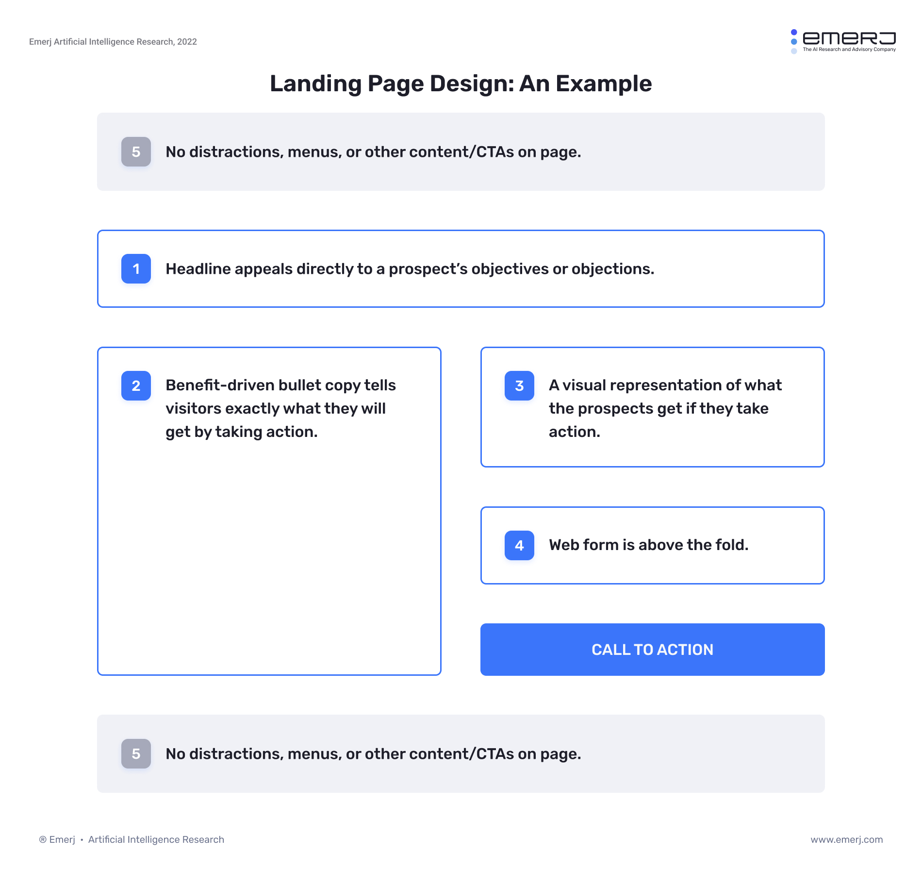
We’ll discuss why each of these points is critical:
1. Headline appeals directly to the objectives or challenges of your potential buyer. The headline encourages a visitor to stay on your page, or to leave. By directly appealing to objectives (goals that the prospect is moving towards) or challenges (problems that the prospect is struggling with), you ensure that the right visitor will have a reason to read on and act. Headlines ideally include a core message, or could at least be a strong attention-oriented topic or theme that you believe to be critically important for your prospect.
2. Benefit-driven bullet copy tells visitors exactly what they’ll get by acting. Tying into the point above, it’s important to convey the benefits of why a prospect should act. While paragraph copy can help to introduce your brand and describe the offer, bullet copy is easier to read and drives home the point faster.
An AI-related consulting company that offers a white paper about AI use-cases in insurance could describe the contents of their white paper this way:
This white paper contains four unique AI use cases in insurance, including applications in fraud prevention and business process automation. We’ve also included a framework for determining the data and integration requirements for any given AI application.
Or, they could describe it this way:
In this 11-page white paper, you’ll learn:
- Four AI applications already in use in finance today – including details of how they work and how they could be applied in your business
- A simple framework for reducing risk by determining the data and integration requirements of an enterprise AI application
- Two business process automation applications already in use at Geico and Liberty Mutual
By adding specificity and drawing out the specific benefits and key insights from the whitepaper, the bullet copy can be a much better medium.
While bullets aren’t necessary, they are usually the best medium to convey the value of an offer in the least amount of time or effort. Paragraphs are intimidating to read, but bullets naturally attract the eye, and they come across as descriptive and include only the information a potential prospect would want to know before taking action.
3. A visual representation of what the prospects get if they act. For an offer to be simple, a visitor must be able to easily imagine what it would be like for them to experience it. Whether it be the cover of your downloadable PDF, an infographic from your upcoming webinar, or whatever else—display something visual above or directly near the opt-in form itself.
They might be asking themselves:
- Is this webinar going to be just a series of slides, or are there going to be interesting charts and graphs?
- I’d like to download this infographic. Is it just a .jpg file, or is there some analysis and text to go along with it?
- Is this whitepaper just a Word document? What am I really getting?
By making the offer visible, it becomes more believable that the offered item exists, and the visitor can feel confident about what they’re getting.
In addition, some readers simply won’t read much of your landing page text, and by catching their eye with a well-designed and well-titled whitepaper or visual opt-in offer, their attention can still be hooked.
4. Opt-in item or web form is above the fold. On a landing page, action should be easy to take. To ensure conversion, make it as easy as possible to see the web form, and know the action to take. On a desktop, this means having both the web form and web form submission button above the fold. On mobile, the form should be a short scroll below the headline and the visual representation of the opt-in item.
5. Remove any call to action (CTA) outside of lead capture. Your blogs, webinars, white papers, or other media may serve to educate readers and build credibility. Your homepage may serve to succinctly frame your value proposition and showcase the benefits of the solutions you offer. A landing page serves to collect leads, and nothing else. The conversion rate of your landing pages should be tracked and improved; these are digital extensions of your sales team – accountable for delivering an outcome.
All in all – your offer should be both clear and compelling for your desired prospect. If you are selling AI for eCommerce, there is no need to appeal to readers in finance. Your goal is to make your offer compelling to the group of people that you want to build a relationship with, and eventually, potentially convert.
An “offer” can be rephrased as “what you will get from me if you take action.” In this case, “action” generally implies little more than an email opt-in, and what the prospect “gets” is some kind of tangible, useful value. The offer cannot be vague or implied. What the prospect gets for acting must be crystal clear, and the compelling utility and value of what they get must also be crystal clear.
This specificity could imply:
- Knowing exactly what they’ll learn with your resource
- Knowing exactly what problems they’ll be able to solve from the advice in your resource
- Knowing how many pages your PDF is, how long the webinar lasts, or how many respondents were involved in the creation of your research
- How they’ll get the resource (we recommend making it very clear that it will be sent to their inbox directly after submitting your web form)
Conclusion
At Emerj, we gear the majority of our promotional and creative services efforts toward thought leadership, but we maintain a strong emphasis on lead generation. The value of landing pages to your firm goes beyond just collecting contact information, offering value, and capturing levels of interest. By following a landing page strategy that makes sense for your firm, landing pages can attract, qualify and convert leads. By investing time, resources, and effort into your landing page now, you can set yourself up to reap the rewards of this solid marketing-strategy tool in the future.


